
Greetings and Salutations pixel twisters and graphic designers! In our continuing series on the fundamentals of graphic design, we will examine the basic principles that will help your website design look more professional.
In our previous articles, we looked at typography and the many ways it is used successfully in the design world. We now shift to how we can incorporate these ideals to the creation and layout of our graphic user interfaces (GUIs).
Topics covered in the next series of articles will include: Alignment, Contrast, Repetition and Unity, Grouping, Layout and Color. In this first article, we begin by discussing the principle of alignment.
How to use Alignment
The simple concept of alignment can be traced to our understanding of human evolution. It is no accident that when things are properly aligned, they will make us feel more secure, comfortable and generally at ease. This phenomenon is exhibited in nature when we look at how people view beauty. For example, when early men and women chose their potential mates, they looked at the physical make up of the opposite sex. If their bodies and faces were properly aligned, this would signal good genetics and on a sub-conscious level, indicate a good potential mate.
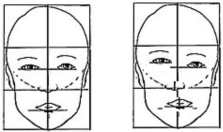
This illustration shows that the more irregularities there are in the alignment of the face the more unattractive that face becomes. If you were to place alignment lines over pictures of models, movie stars, or anyone generally deemed to be attractive, you would find more of this kind of symmetry than less. Incidentally, this seems to be a universal phenomenon found in any part of the world, regardless of cultural and ethnic differences or preferences.
However, we’re creating graphic design and not necessarily looking for potential mates, so how does this rule apply to web design. A good rule of thumb when considering alignment is to find a strong element on your page to align something against. Anything that is just a little out of alignment will look like a mistake.

In this example we can clearly make out that the focal point is the word killer sites. That makes sense, as it is a business card for that company and is probably the most important element on the page. So drawing attention to this through the use of an effective type contrast is a good start. However, what really kills this card is the fact that there is no common alignment to speak of. It doesn’t help direct the viewer’s eye to anything and leave you with the uncomfortable effect of not knowing where to go next. Given that Western audiences read left to right, your eye more than likely wants to travel to the top left hand corner.

Now this next version doesn’t help much at all. Making the name in the top left corner bold might make my eye move there after looking at the company name, however, I’m still kind of lost as to what to do after that. Move to 1234 gigabyte? Then jump over the logo and read the email address? This has nothing that grounds it and makes for a rather unsuccessful design.

This example is much more improved by simply aligning all of the words against the most dominant element on the card which happens to be the logo or company name. Other principles like grouping all of the contact information together and creating a separation from the main text also greatly improve the effectiveness of this design. Things are kept simple by aligning all elements to the left.

Even changing the alignment to the right can work and in some ways make the work look a little more sophisticated. Again, as with the last example, all of the elements are aligned against the most dominant focal point on the page. Nothing feels as if it has been thrown on the page indiscriminately or by accident. You can almost see the invisible line that is created when using good alignment. You don’t need a ruler to see the line; you just know it’s there.

This last business card example shows how adding more contrast can also effectively increase the sense of focal point, and provide a stronger element against which you can align your text. It feels clean and communicates better than when our eyes were bouncing all over the card. We just follow the line straight to the bottom.
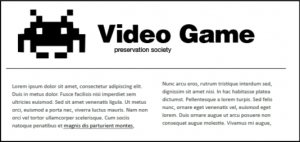
The alignment in this example doesn’t look terrible, but there are some very subtle changes that can be made to improve it. Why are the logo, thin line, and paragraphs not aligned on the left side? Why is the thin line not aligned with the right paragraphs? The words “video game preservation society” looks as though they have been haphazardly placed with no intent to align.
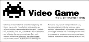
Notice how the small improvements have made this piece look so much better. Alignment is achieved on the left with a strong logo chosen as the defining line. Paragraphs are now aligned with each others tops. The thin line has bee brought in to align with both sides of the left and right paragraph. The logo and text have been made bigger, and the words “video game” has also been aligned to a strong defining line in the illustration. “Digital preservation society” has been aligned to both the beginning of the G in Game and to the right side of the thin line.
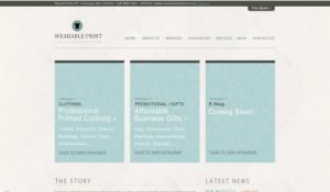
Here is a screen shot from a website called wearable print. It is well designed with good examples of alignment. Nothing is positioned by accident.
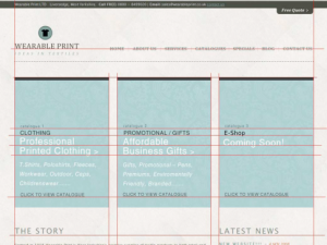
With redlines in place, you can see how it all lines up in a neat set of columns. Notice how the text in the boxes is also in alignment. The spacing between the boxes is also identical. My only criticism would be the alignment of the links in the top navigation. The links would look better aligned if they ran through the bottom of the text rather than aligned to their centers. The baseline for the logo “wearable print” is strong enough to provide a good alignment line for the bottom of the links.
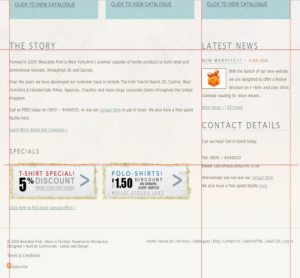
The bottom portion of the website follows the same good alignment from the top. However, notice how the footer looks sloppy because of the elements on the left and right that are slightly off.
Popularity: 5% [?]


